Brief:
A freelance project for the design agency Line of Sight. The goal was to transform their static logo into a motion piece that visually communicates the core concept behind the company's name: a direct, unobstructed path between two points.
A freelance project for the design agency Line of Sight. The goal was to transform their static logo into a motion piece that visually communicates the core concept behind the company's name: a direct, unobstructed path between two points.
Idea:
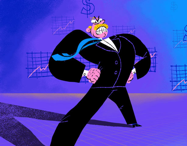
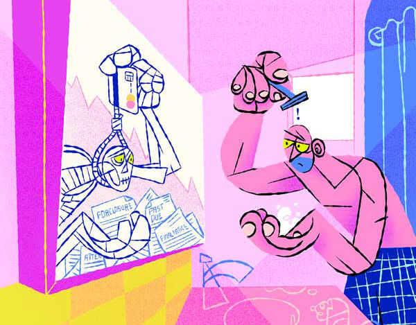
The animation first illustrates the literal meaning of "line of sight" by showing a character's clear, direct view over a horizon. This visual representation serves as a conceptual foundation for the animation before it transitions to the logo. The final part of the animation connects the conceptual "line of sight" to the company's logo, symbolizing how the agency helps its clients achieve a clear understanding of their goals and vision. The entire sequence is designed to be a clear, simple, and impactful representation of the company's identity.
The animation first illustrates the literal meaning of "line of sight" by showing a character's clear, direct view over a horizon. This visual representation serves as a conceptual foundation for the animation before it transitions to the logo. The final part of the animation connects the conceptual "line of sight" to the company's logo, symbolizing how the agency helps its clients achieve a clear understanding of their goals and vision. The entire sequence is designed to be a clear, simple, and impactful representation of the company's identity.
Results:
The animated logo was integrated into the company's website and social media channels to establish a strong, memorable brand presence. It has since become a key visual asset for the agency, contributing to a cohesive and professional brand image.
The animated logo was integrated into the company's website and social media channels to establish a strong, memorable brand presence. It has since become a key visual asset for the agency, contributing to a cohesive and professional brand image.